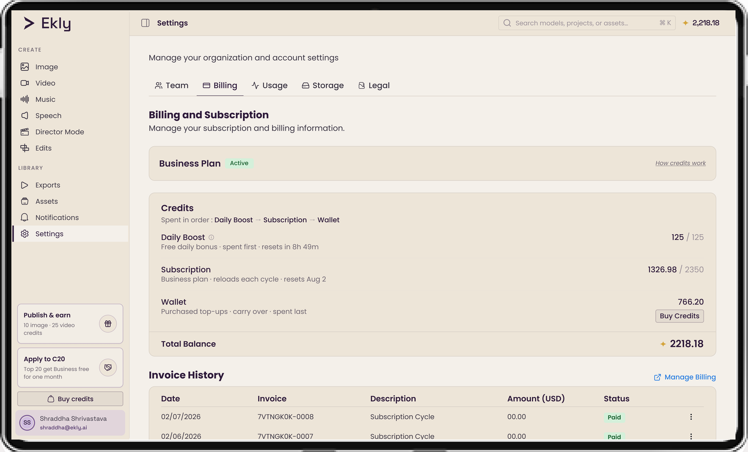

A new logo for Ekly, and the system that made it stick
Sole Product Designer · Nov 2025 – Sep 2026
New logo, custom icon set, the “Slate Plum” colour language, and the design-token system that carried it across the whole product. Designed in Figma, then shipped in code. Live in production today.
The insight
Ekly sells AI video, voice, and brand tools to teams, and those buyers won't hand over their brand unless the platform looks like it can be trusted with it. The product was already strong; the opportunity was to give its visual identity the same enterprise polish, so the brand on the outside matched the capability on the inside.
But the real problem wasn't taste. It was entropy. Colour lived as hardcoded hex across ~250 files with no source of truth, so every new screen drifted a little further off-brand. That changed what the job actually was: not a reskin, but a trust-and-consistency problem that only a design-token system would fix. The logo and palette were the part you could see. The system underneath was the part that had to hold.
The starting point
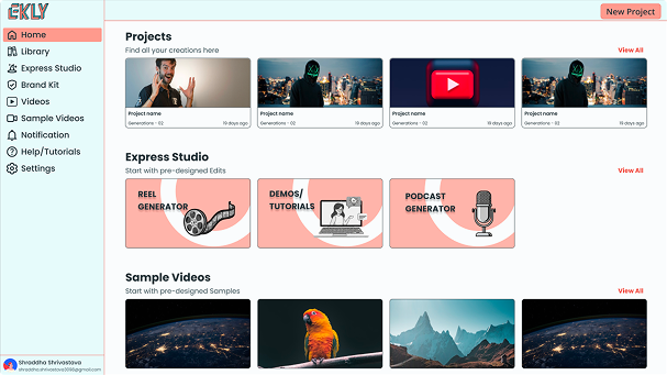
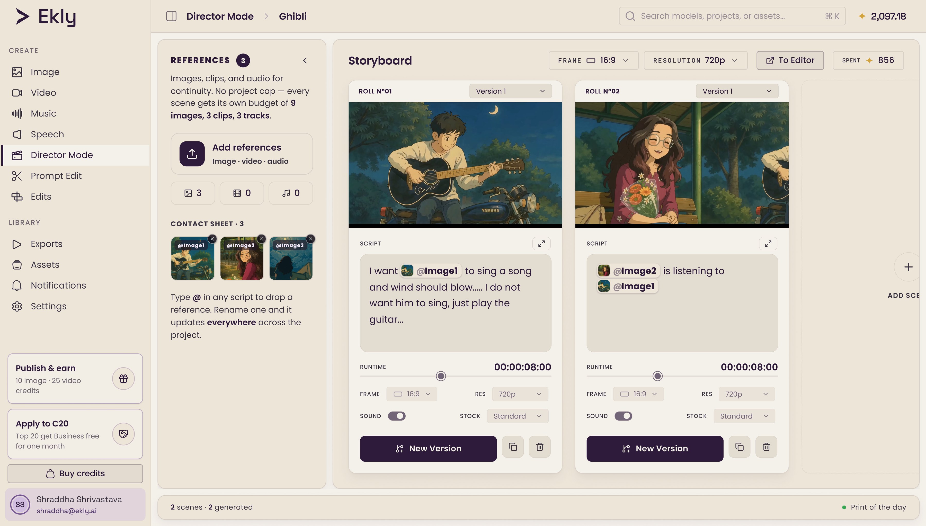
Like most fast-moving products, the visual language had grown piece by piece: a gradient wordmark, a sidebar colour with no tie to the brand, navigation icons in a few different styles, accent colours with no tokens behind them. Colour lived as hardcoded hex across ~250 files, with no dark-mode system and no single source of truth.
The goal was to make the brand read as premium and enterprise-ready, as confident as the product itself: the kind of tool a Walmart, Amazon, or Google would trust with their video. So I rebuilt it in order: the logo, then the colour, then the system in code, then every screen size.
First, the logo
Every AI logo looks the same: purple gradients, neural-net swirls, lightning bolts. None of it means anything anymore. Ekly needed a mark that actually said something. It took three directions to get there:

The E as a faceted crystal. Striking at display, but it got noisy at 24px, and the gradient would date fast.
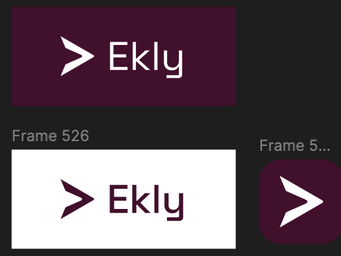
A forward play-arrow: press play, move forward. The one that held at every size without leaning on a letter. This became the mark.
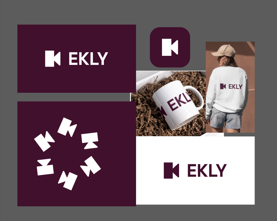
The K mirrored into a rewind glyph. Clever, but it leaned on reading the letter.
The play button already lived in everyone’s memory.
The AI star already meant something.
The mark is what happens when you subtract one from the other.

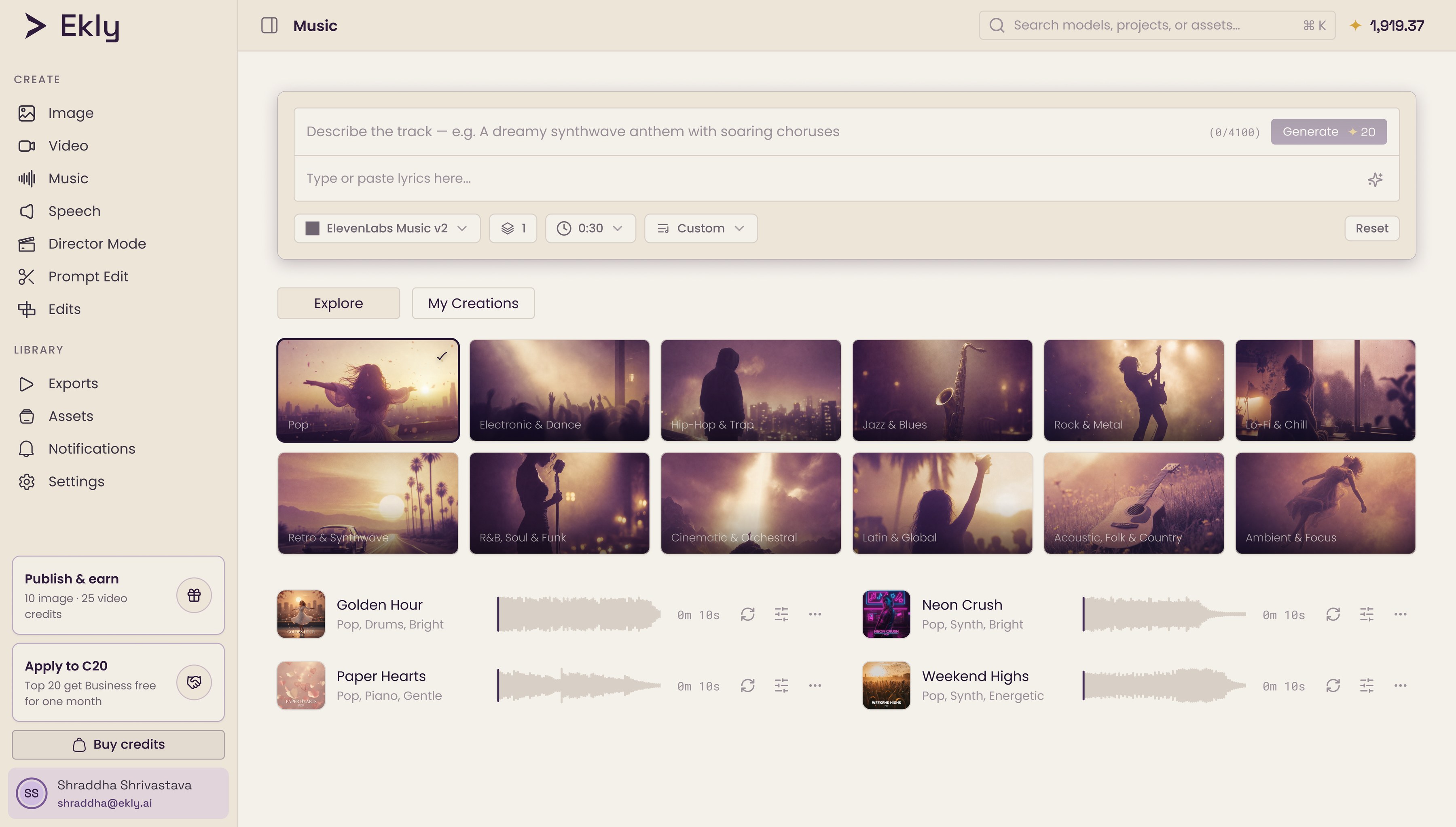
I drew the icon set the same way, from scratch on a 24px grid, because no off-the-shelf library covers video editing, AI generation, and brand assets without looking assembled.

Then, the colour
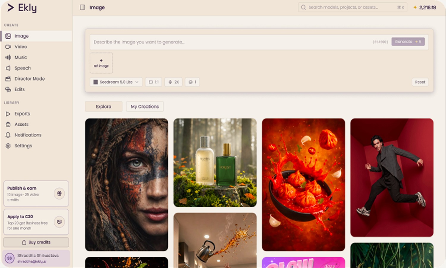
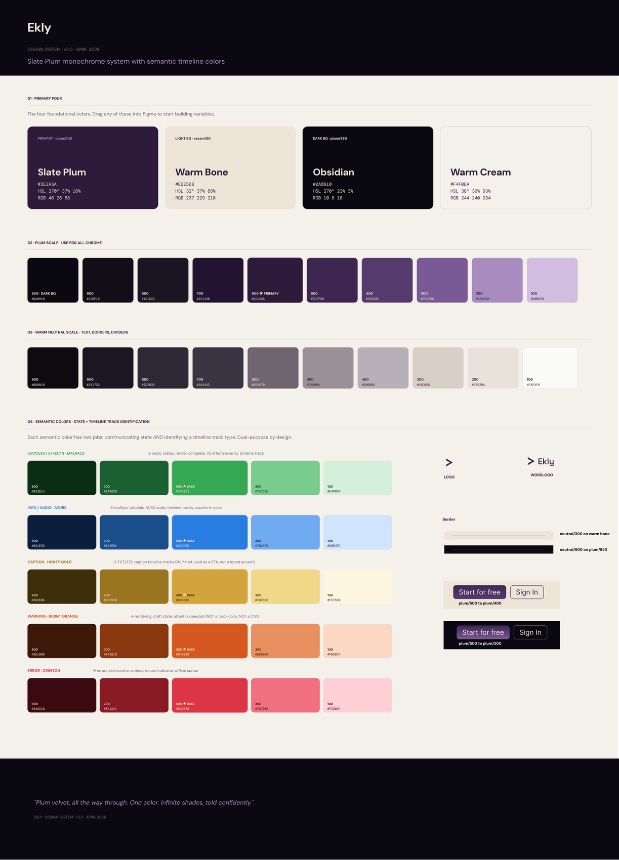
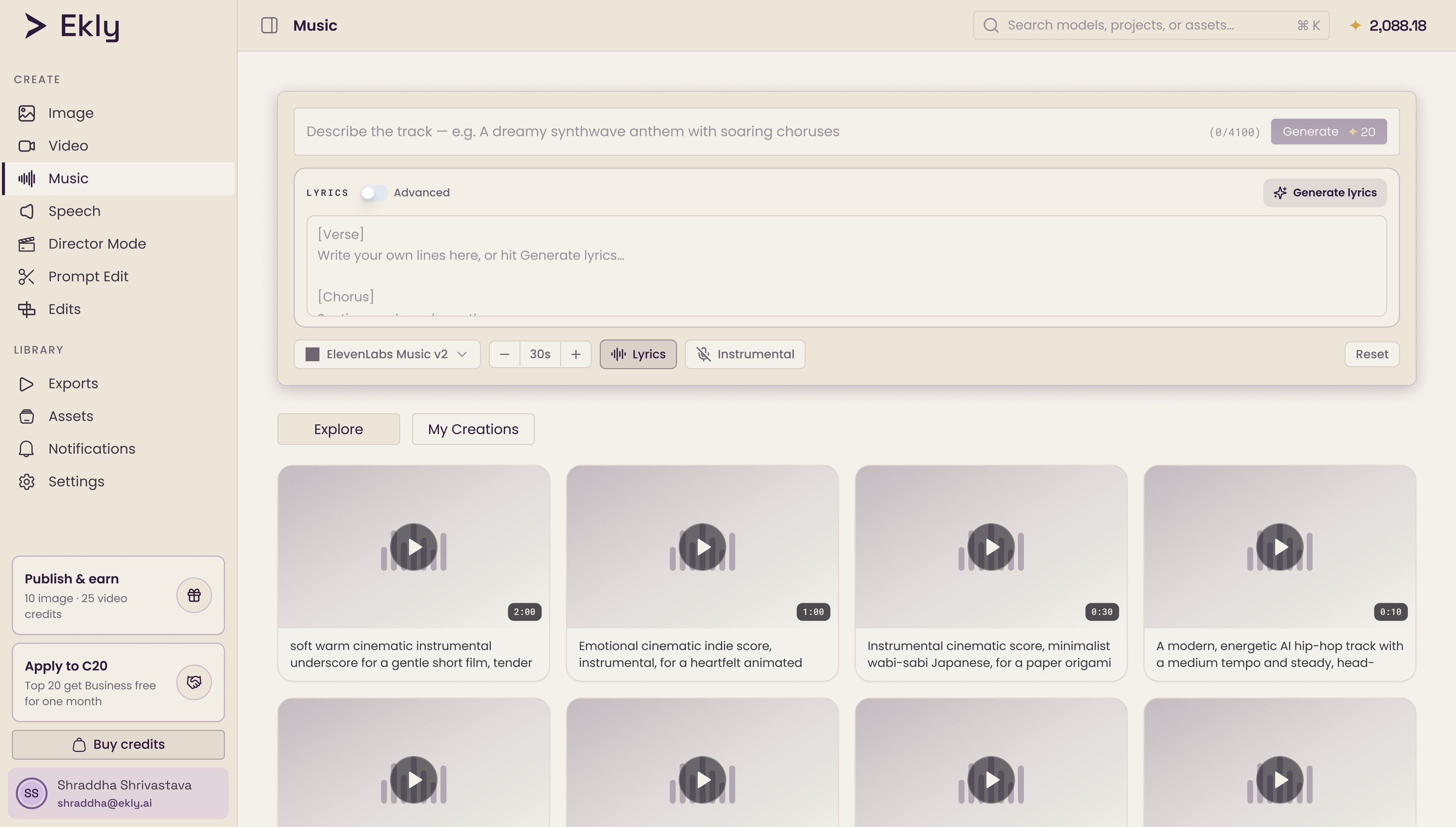
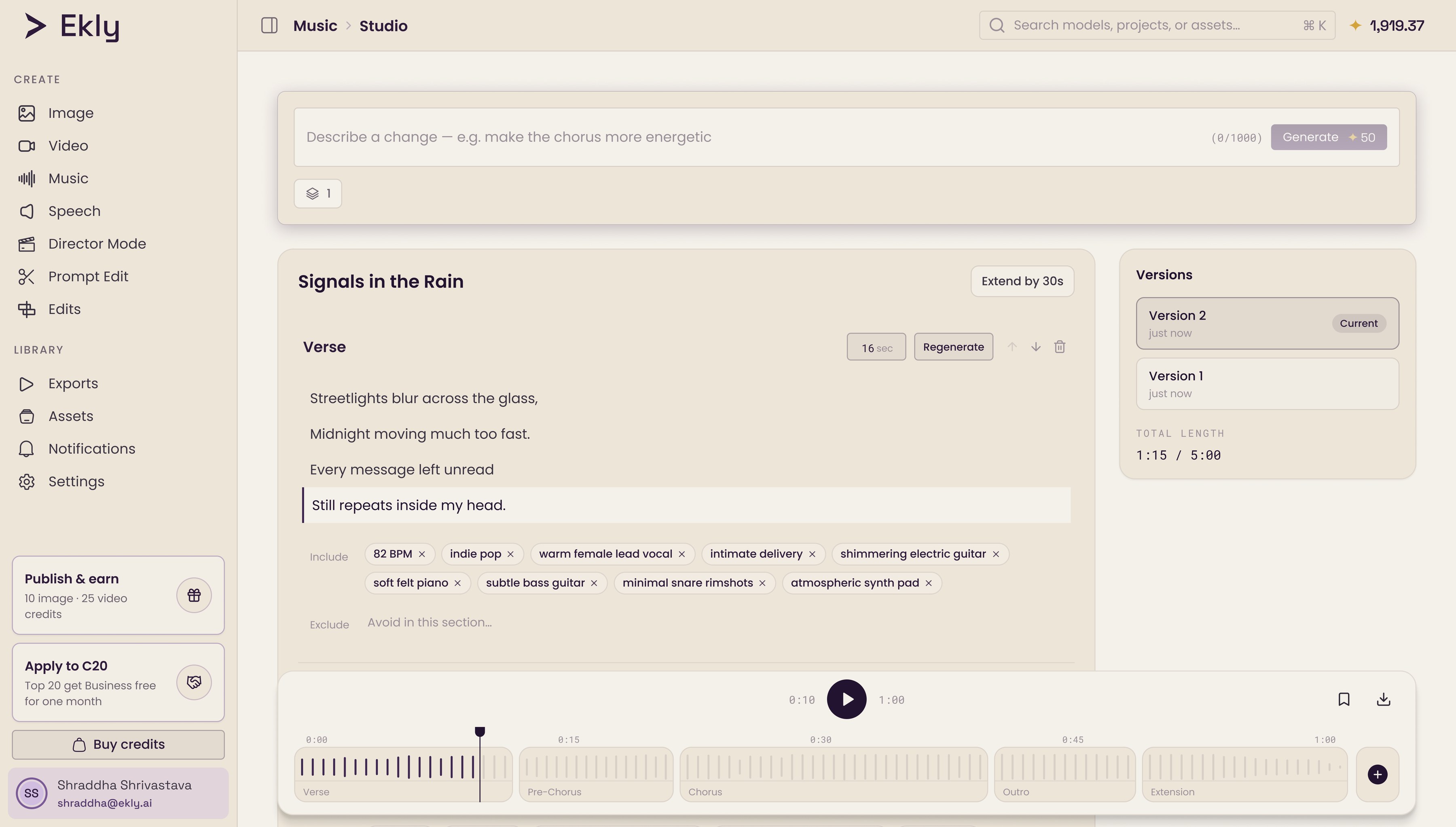
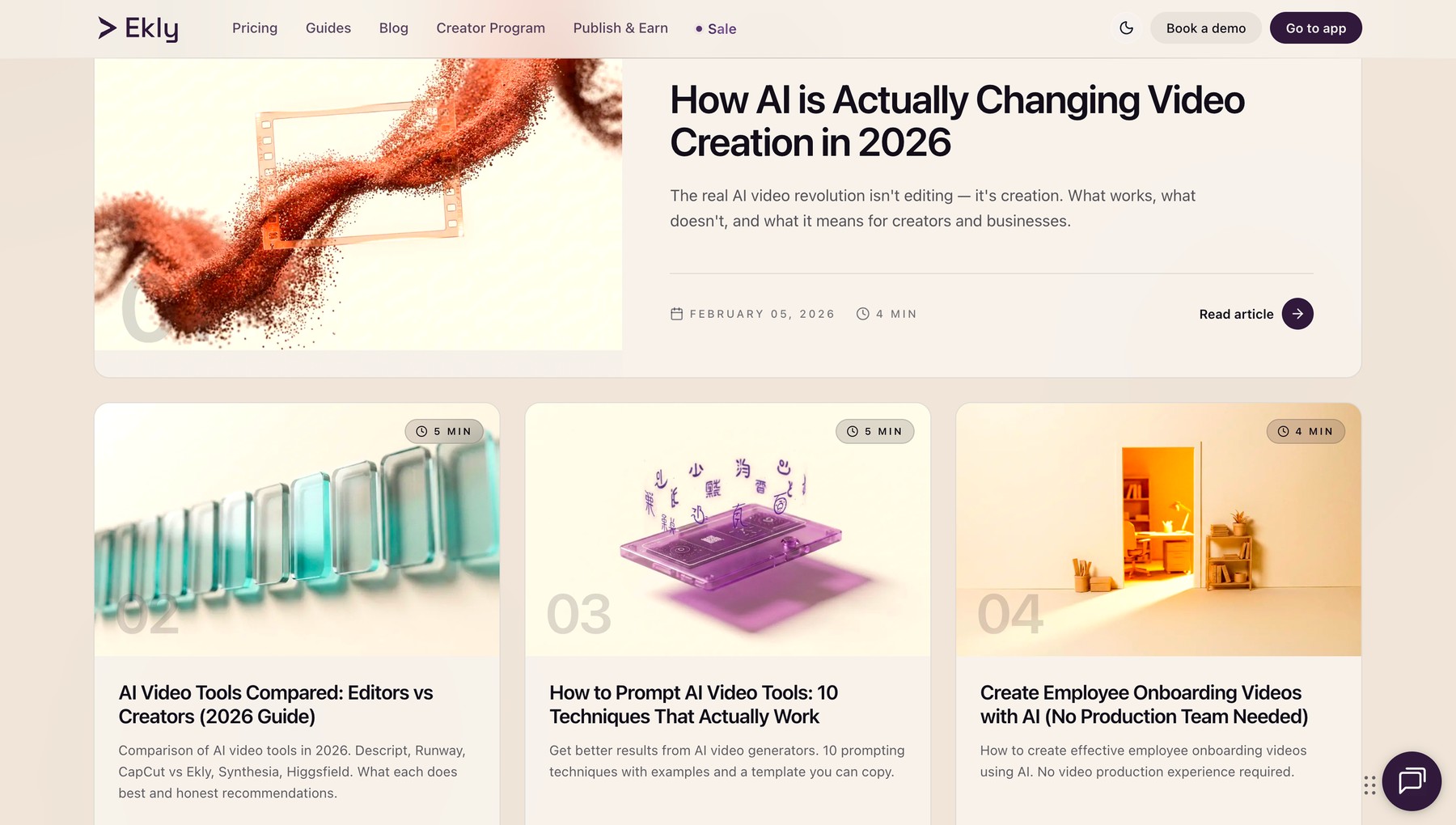
"Slate Plum": a deep purple with red warmth, anchored on #2E1A3A. It reads premium where a blue-based purple would read cold-tech. The neutrals are deliberately warm: no grey goes blue, nothing feels clinical, because Ekly is about human content: video, voice, brand.
Every semantic colour pulls double duty: it flags a UI state, and it marks a track in the timeline editor. If a colour couldn't do both, it didn't make the cut.
Then, into code
I don't just hand off. I shipped it. Flipping the global colour variables broke the UI, because most of the app used hardcoded hex, not those variables. So I migrated element by element, live, and encoded the palette as Tailwind tokens. The 39 shared primitives went first, so every new component renders on-brand by default.
Hundreds of files. Zero visual regression.
Then, every screen size
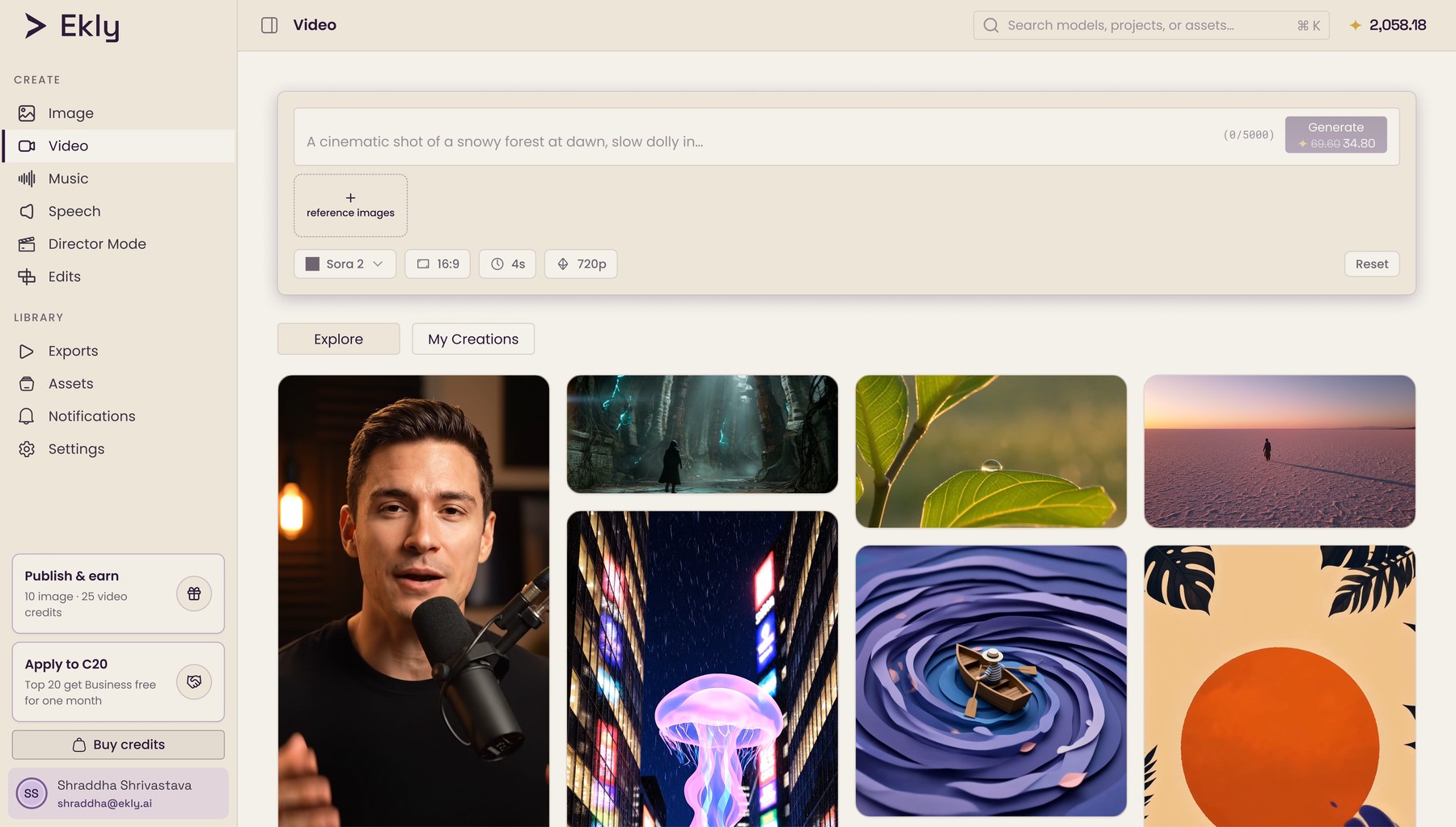
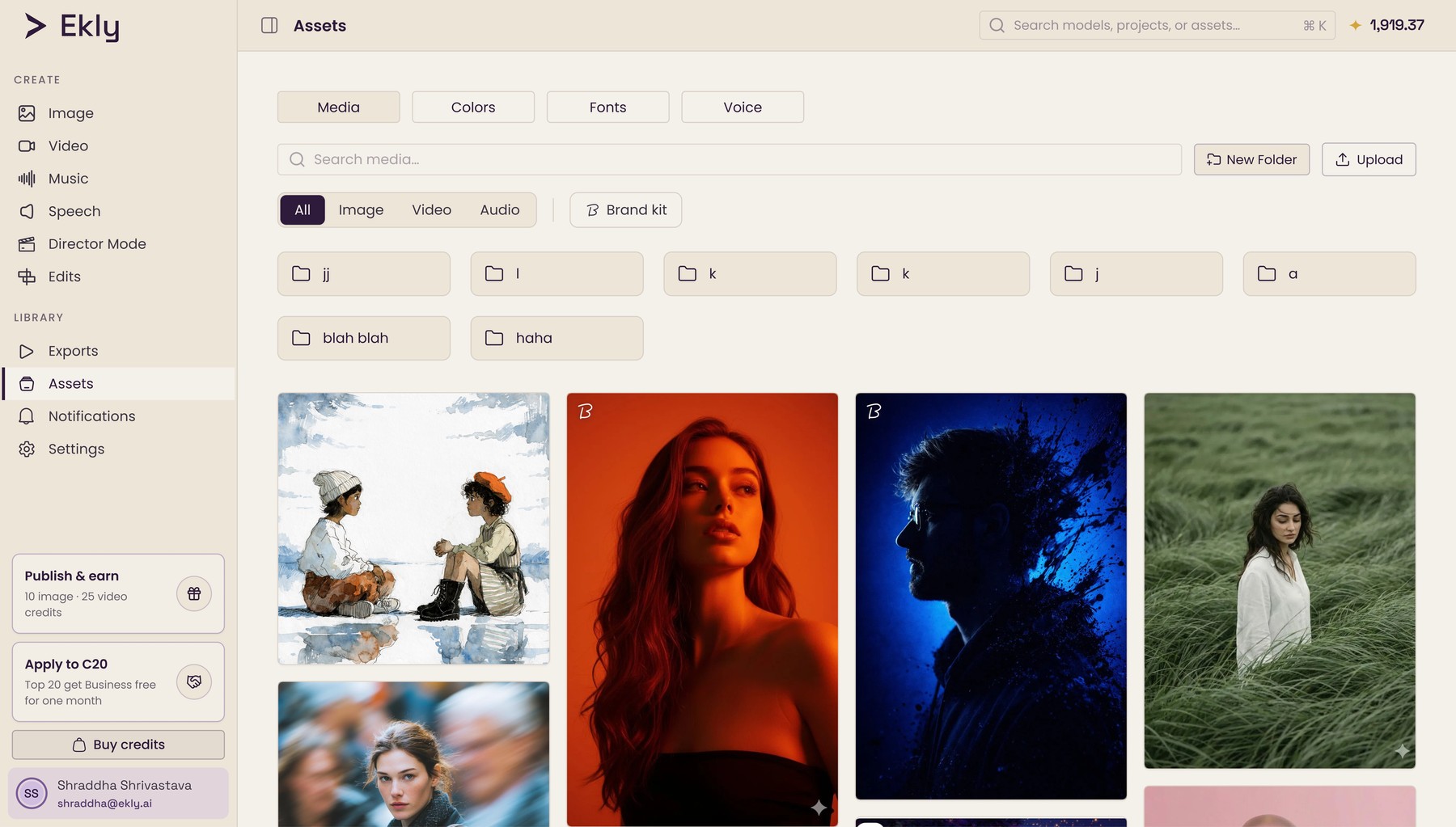
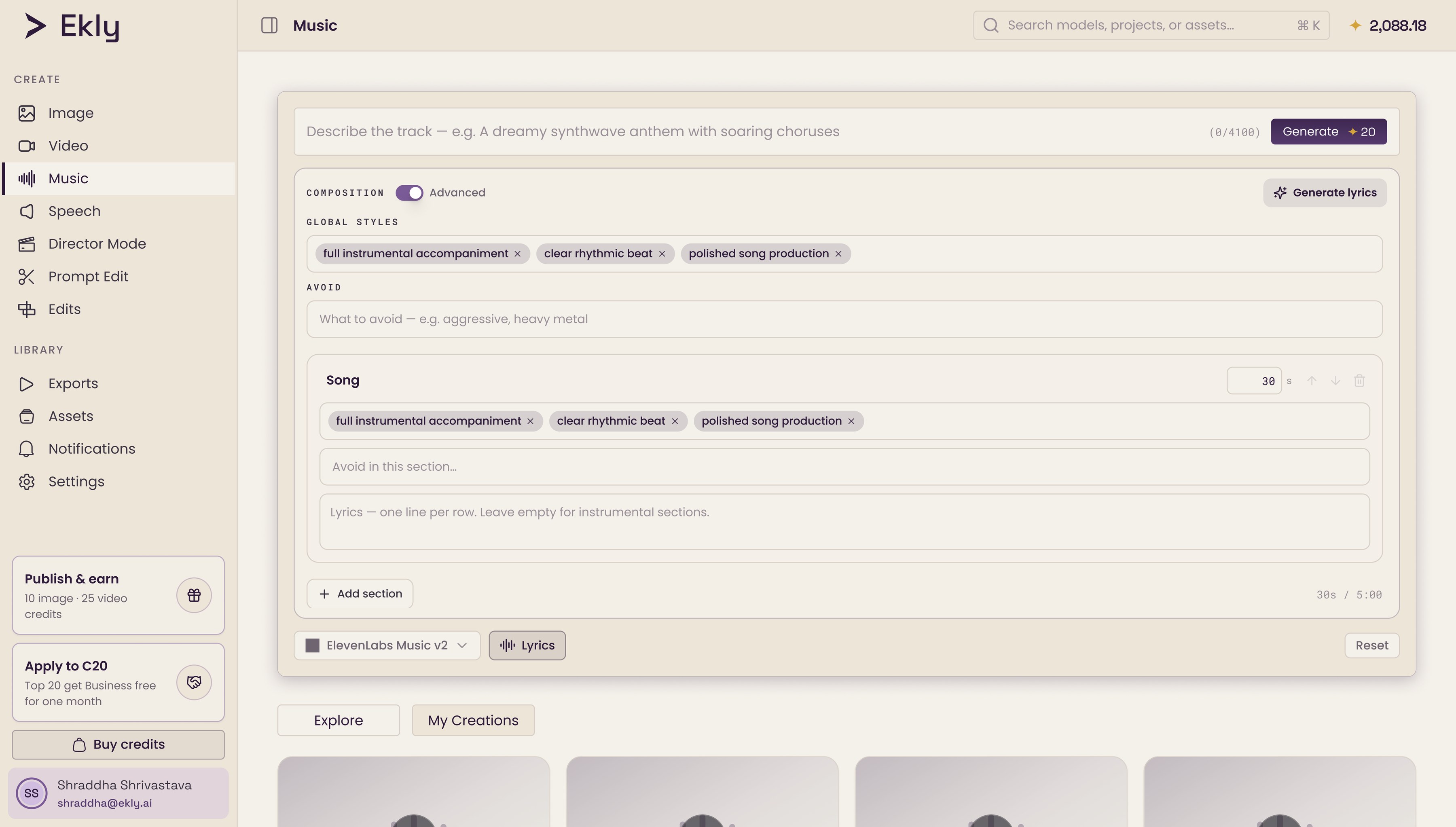
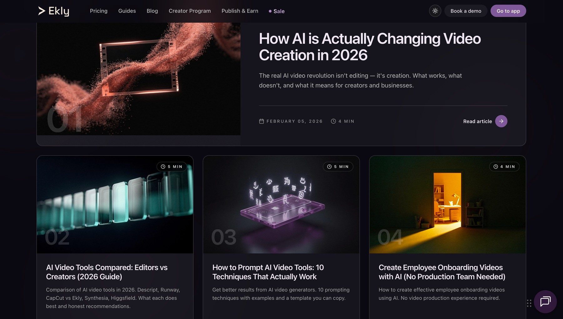
The dense, multi-panel surfaces were the real test. In the 200+ component editor, a docked panel and the timeline can't both fit below ~1374px, so instead of shrinking the controls into useless icons, I floated the panel over the canvas: full editing width, nothing clipped, a bottom sheet on mobile. Light and dark were designed in parallel from the start, never a palette swap.
Live, and holding
It shipped. Slate Plum is Ekly's production look now, merged into an active 8-engineer repo with no downtime. The ~250 files that used to carry inconsistent colour all resolve through one token system now, both modes, marketing site to editor. It's the team's Design System v2.0, used daily by 20+ people.
And it's showing up where it counts: Ekly grew alongside the product from 0 to ~100 weekly active users. As v2.0 matured I tracked the design-side proof too: time-to-ship for a new surface, the share of components that render on-brand by default, and design-QA time saved.