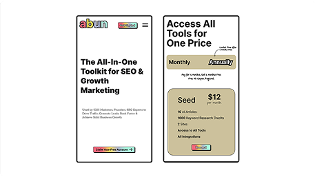
Redesigning abun.com: from clutter to clarity
Self-initiated · 2 days
Self-initiated redesign of abun.com’s landing page. Not affiliated with Abun.
Cutting a 20,000px, cluttered marketing site down to a breathable, scroll-friendly experience, with a warm gold-beige system, clear hierarchy, and a refreshed brand.
The problem
abun.com had the tools but buried them. The page was cluttered, the hierarchy was weak, and there was no warmth to it, so in the first few seconds a new visitor couldn't tell what the product actually did. For a tool asking people to trust it with their SEO, that's a costly first impression.
What's broken
Overly long page
The site stretched over 20,000px, tiring to scroll and hard to find key information quickly.
Lengthy pricing cards
The price sections were too long and difficult to compare at a glance.
Inconsistent colours
Too many clashing shades made it look messy, and the algae-green highlights especially felt out of place.
Weak logo personality
The logo felt generic and lacked brand identity, making it forgettable.
Misaligned footer
No alignment or brand personality: cluttered, disconnected, and visually unbalanced.
How I solved it
I cut the 20,000px scroll into clear, sized sections and gave it a warm gold-beige palette to pull everything together. The hierarchy got rebuilt and aligned, footer included. I shortened the pricing cards so you can compare them at a glance, and redrew the logo so the brand finally has a face.
Before & after
Each frame pairs the original with my redesign, section by section across pricing, features, the value proposition, and reviews, with notes on the decision behind each change.

Outcome
The page is calmer and far easier to move through. Less clutter, a clearer hierarchy, one consistent colour and spacing system, and a brand that feels warm instead of generic. Every section now has a job and does it.