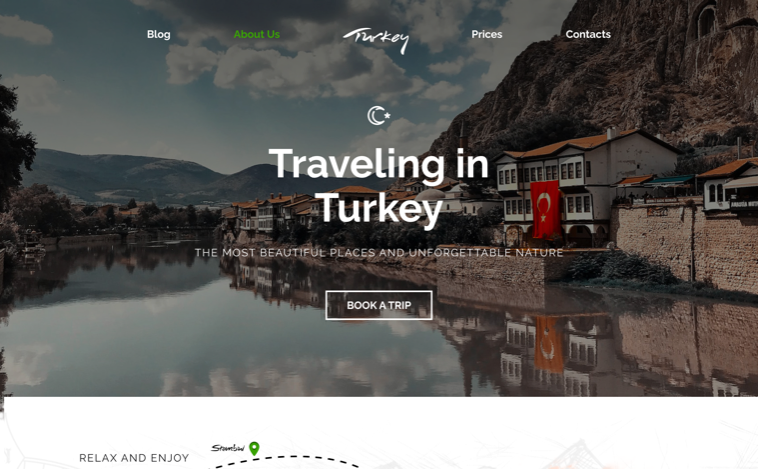
Traveling in Turkey: a site that feels like the journey
Concept project · 3 months
Reframing a booking-first travel site as an immersive journey: large visuals, minimal text, and one consistent system that holds from desktop to mobile.
The problem
Most travel sites are built to sell a booking, not to make you want to go. They're crowded, ad-heavy, and thin on anything that actually inspires. I wanted the opposite: Turkey as a place worth exploring, carried by storytelling, big imagery, and navigation that stays out of the way.
What's broken
- Existing sites looked crowded and text-heavy, making content hard to digest.
- Nothing about them pulled you in, so people left fast.
- Users found it hard to move between travel blogs, schedules, and guides.
Design goals
- Hold up on every screen, desktop down to phone, without feeling shrunk.
- Let Turkey's colour and energy drive the interface.
- Keep it beautiful without making it harder to use.
How I solved it
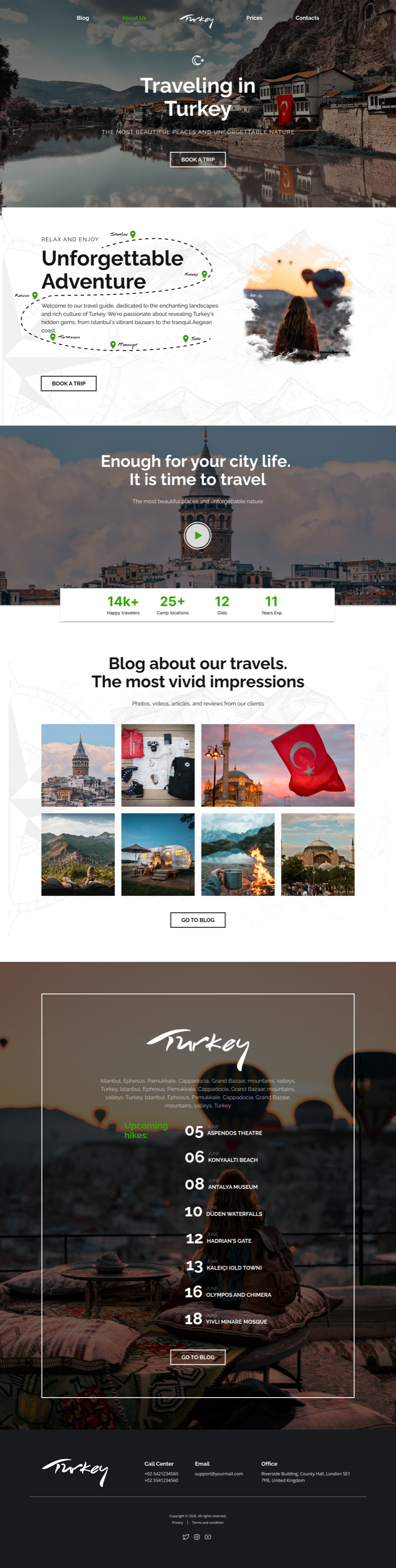
I built it around big visuals and short text, with enough structure to keep you oriented: large imagery, minimal copy, clear navigation. One design system locked the type, colour, and spacing, so the hierarchy reads the same way from a desktop hero down to a phone.
Final screens
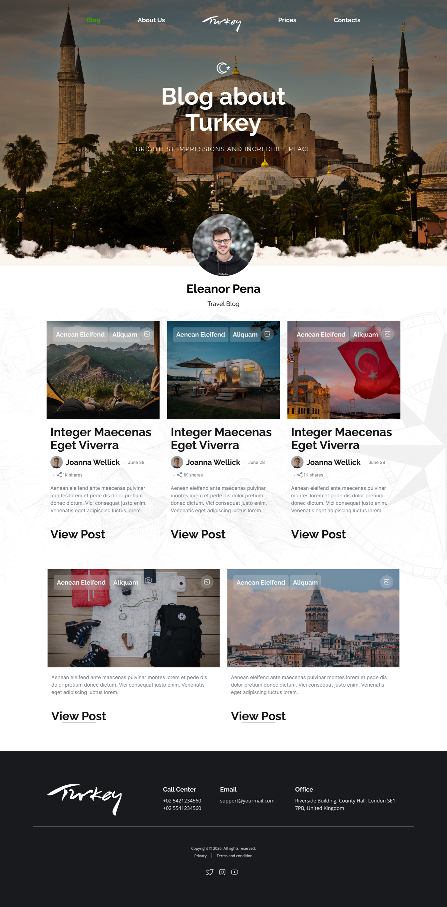
One system, two breakpoints: the travel site and its blog, each shown on desktop and mobile side by side.


The design system
A small, consistent system kept the site coherent across every page: a deep, photographic dark base that lets travel imagery carry the mood, a warm accent for calls-to-action, generous spacing, and a clear type hierarchy that keeps long-form readable. Every component (cards, guides, blog) draws from the same tokens.
Outcome
It reads like the trip, not a checkout. Planning feels inspiring instead of exhausting, and the same system holds from the hero down to a long blog post. A travel site can tell a story and still be easy to use, and this is the proof.